


In our 14th year, we are proud to be unveiling our new look, to support a refreshed strategy for Dementia Adventure.
The brand refresh underpins our vision to ensure a more active and fulfilled life for everyone living with dementia, and underlines how we challenge misconceptions by thinking differently about dementia, and focusing on what IS possible, rather than what is not.
We’re a small charity, but research shows our work makes a significant difference to those who access our training or have a supported holiday. We want to help as many of the 900,000 people with dementia in the UK, and the 700,000 who care for them.
According to our 2021 survey, less than 50% of people living with dementia had heard of Dementia Adventure, including those caring for them at home or as part of their work. This figure is unacceptable to us, so as part of our brand new 3 year strategy, we are prioritising brand awareness. Put simply, the more people hear about us, the more people we can support.
The brand refresh is one of several ways we are increasing people’s awareness of Dementia Adventure. We are very grateful to the players of People’s Postcode Lottery, who have funded the research and the work to help us reach as many people with dementia as possible.
About the Visual Identity
One of the most obvious changes is our logo. Research showed that people liked our name and understood who we are and what we do from it. But our previous logo (a large ‘D’ and ‘A’) didn’t show our name clearly enough. So when people saw it on vans, or clothing or social media, they didn’t know what it stood for.
On our new logo, the words Dementia Adventure are front and centre. This makes the logo far more accessible, and it’s much clearer who we are.
As ever, our colours are all inspired by nature. Green is still our predominant colour, but we have introduced some other colours such as orange and purple to catch the eye and add some interest. We have chosen all the colours with accessibility in mind. Interestingly, for people with dementia with a decline in vision, green is often the colour they see for longer.
We have tested our new fonts. They are fully accessible, and are less ‘corporate’ – to show our values of care, positivity and inclusion.

We have introduced some graphic elements to use in our design work, such as contour lines and positive photography. It’s been helpful to hear the thoughts of people with dementia as we have gone through the design process. In particular, they have some great comments on the wavy lines, saying they reminded them of,
- The lines on a map
- The journey of the ups and downs of life with dementia
- The grain of a tree
- Brain waves
Are we changing what we do?
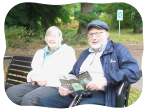
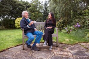
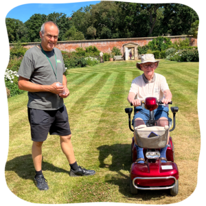
No! We may have a new look, but we still want everyone living with dementia to live a more active and fulfilled life. It’s our mission to support people living with dementia to get outdoors and experience the benefits of nature. And we do that through training, research, and supported holidays.
Dementia Adventure CEO, Fiona Petit says,
“I am really excited about our refreshed brand, and I hope you like the new look and feel as much as we do. As we emerge from a difficult few years, which have seen Dementia Adventure innovate and adapt, our refreshed brand better reflects what we feel and believe at Dementia Adventure. And I am confident it will help us connect with more people and open up opportunities for us to improve the quality of lives of more people living with dementia.“
If you have questions about the brand refresh, please contact our Communications Manager, Jules Loveland.